The Money Pit (Part 1)
I suppose if we’re going to be telling you about our home renovation DIY flops, we should probably go ahead and show you what we’re working with here. I was hoping to avoid this post until we had some – any – completed “after” pictures to share, but alas, 2-1/2 years of home-ownership hasn’t spawned in us any sense of urgency.
Until now.
Because now you can see this and now I feel judged.
And I don’t like feeling judged.
So with no further stalling, here is the shameful love-child that we call home:

Whew. That actually wasn’t so bad. The house might even be kinda cute… or maybe that effect is caused by the elated first-time homebuyers standing on the front step on C-Day (Closing Day). What’s there to be embarrassed about? The rusted-out porch light? Nah… that adds character. The backwards storm door? No, we love the challenge of opening two doors two different ways just to let someone inside. And the weed-bed in front of the porch? Completely intentional.
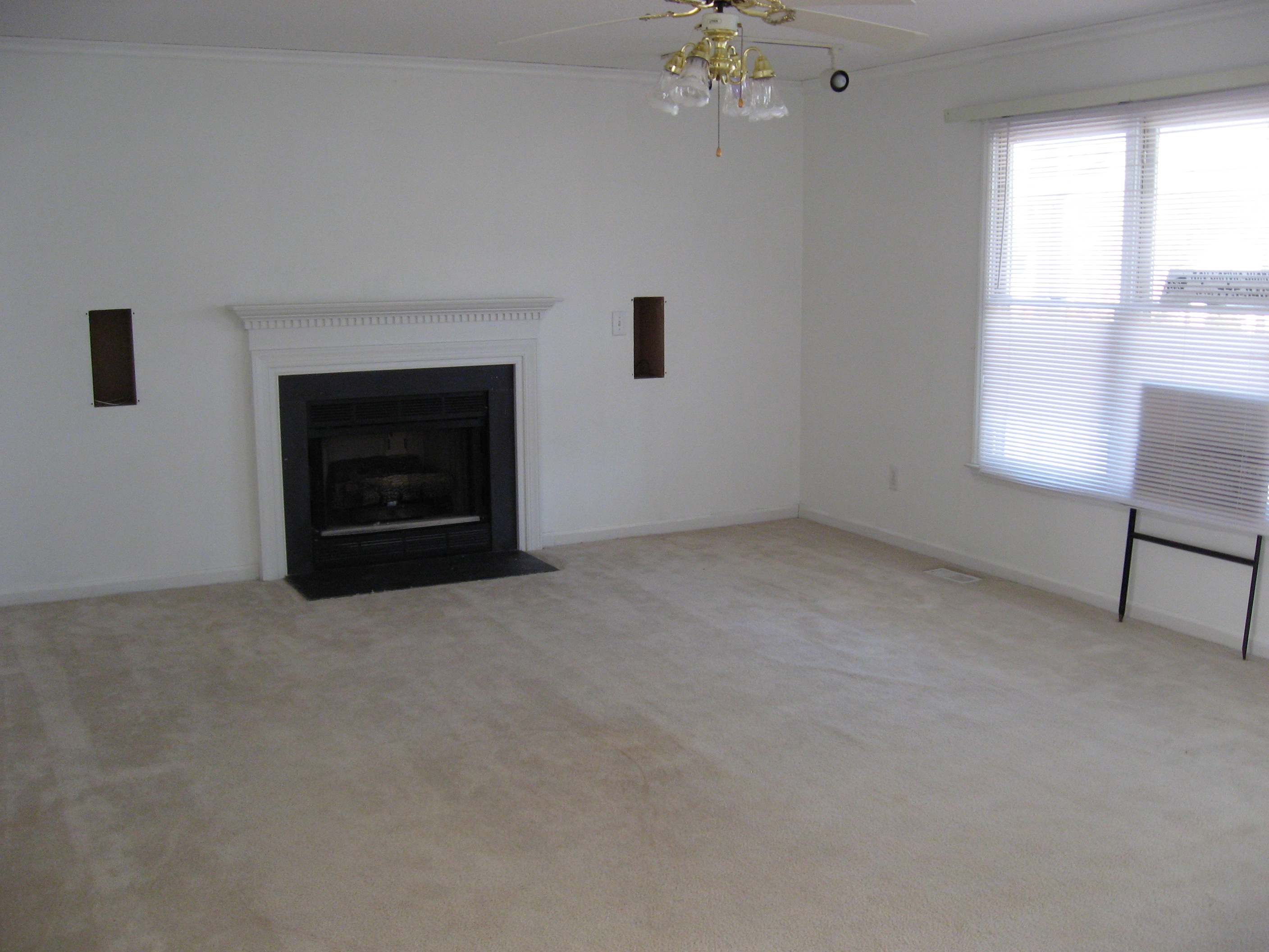
So that was the easy part. Really, the front exterior is the least of our worries. Now we enter into the living room, as-seen on move-in day.

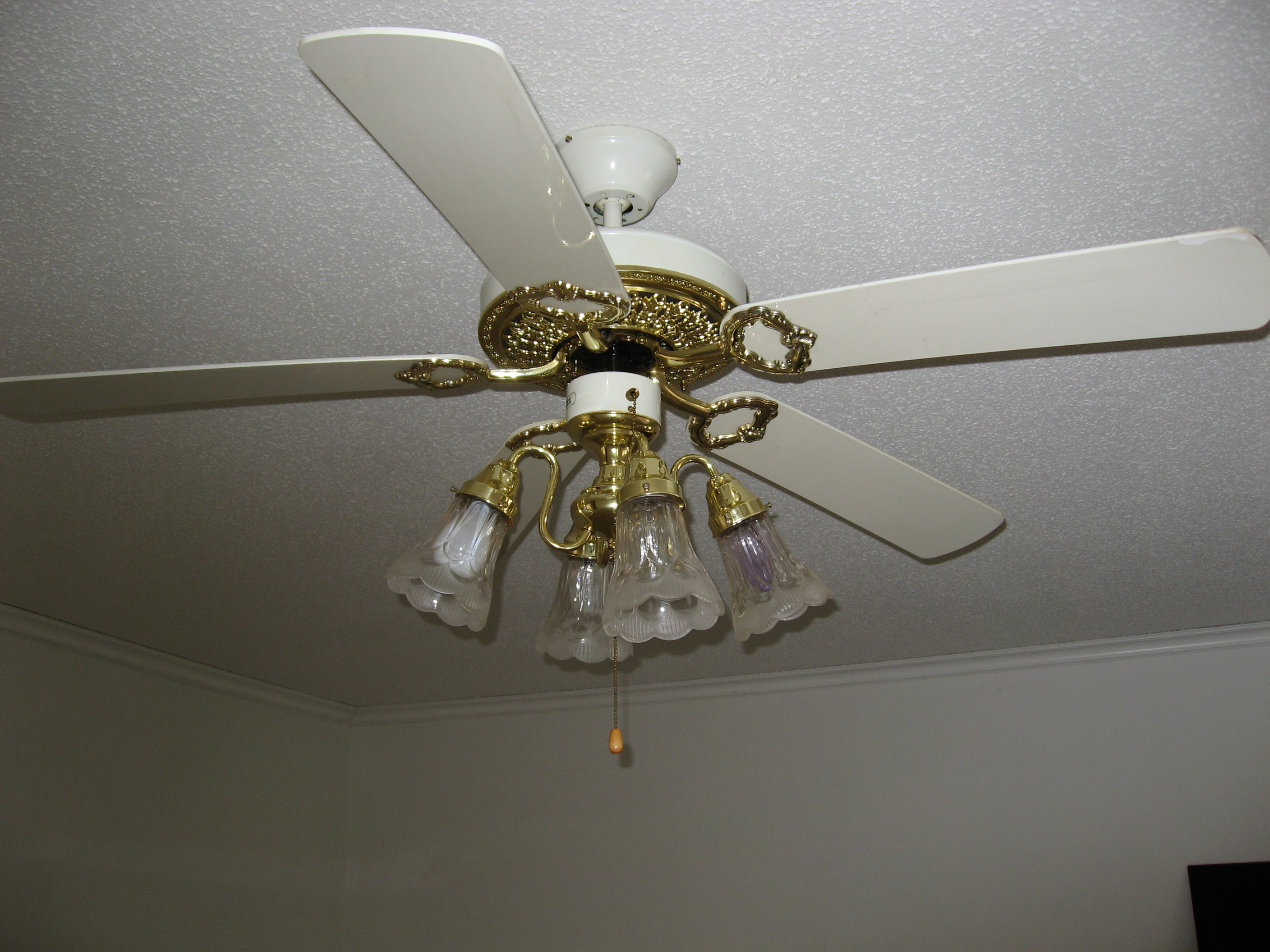
Okay that was a bit more painful. Popcorn ceiling, speaker cutouts, aluminum blinds, and what’s this? One of the ugliest fans we’ve ever seen? (Just one of the ugliest – we have this one beat. Stay tuned.)

And we can’t forget this little number… track lights from the ’80’s? But the house was built in ’94!

Suffice to say, this room was needing some work.
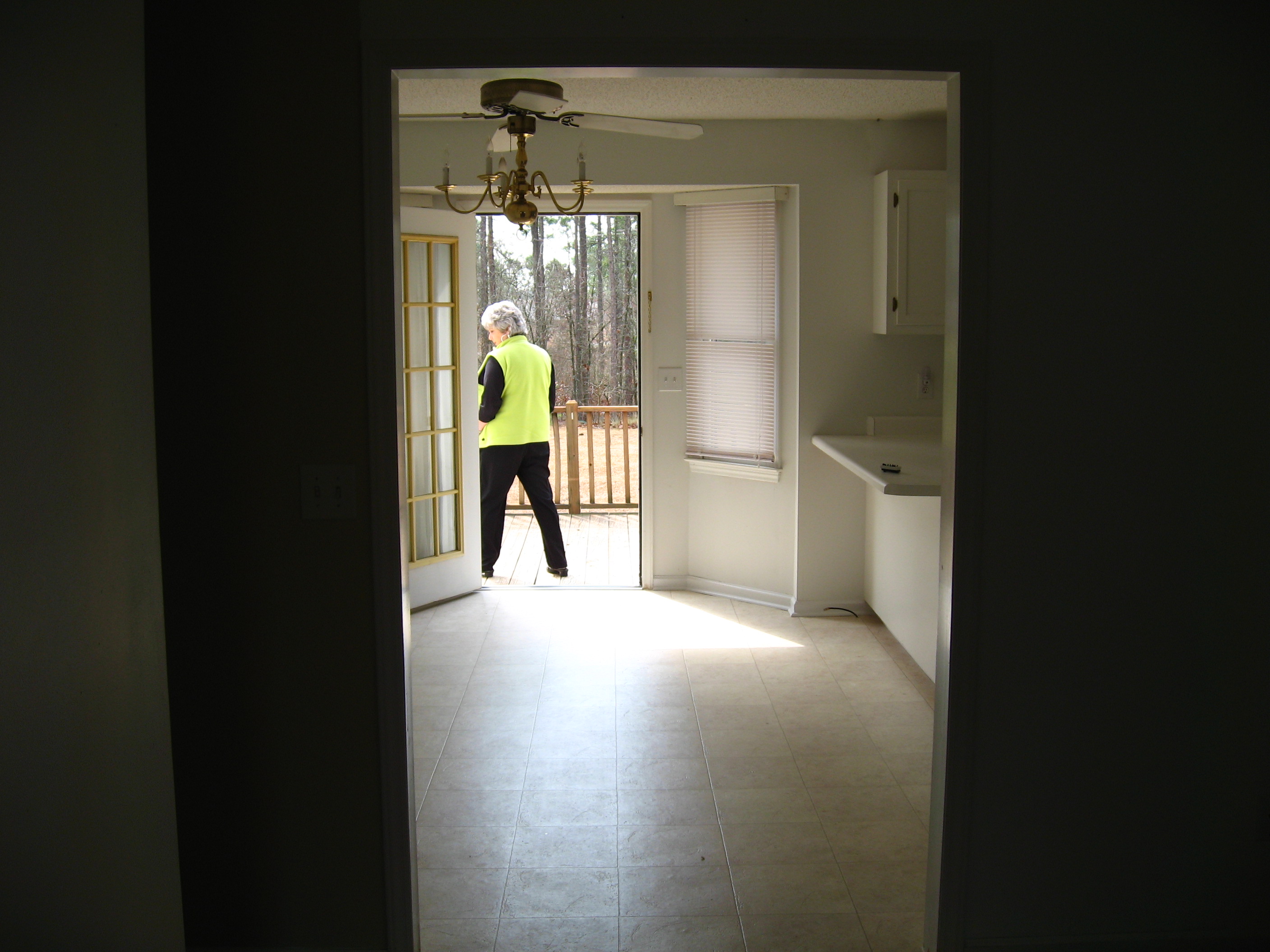
And the kitchen. What can I say about the kitchen, except that the original builders must have LOVED the color white. And brass. And then more white.


We are currently in the midst of an excruciatingly-long, exceedingly-trying kitchen renovation. It has seriously sucked up the last year and a half of our lives. So rather than show just one in-progress picture, this project warrants its own post (or several).
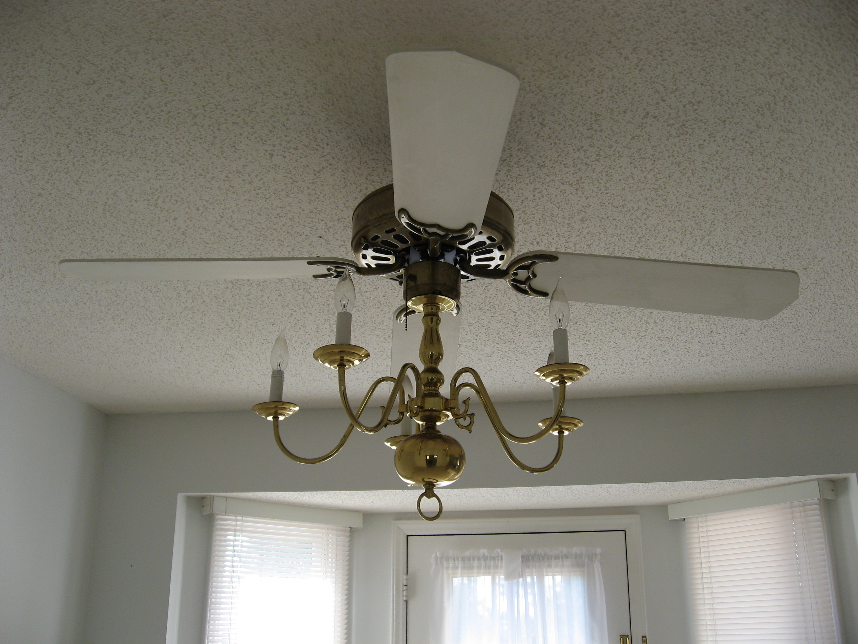
But the worst of the kitchen monstrosities is this… this thing that was left to us by the previous homeowners. It was hanging directly over the kitchen dining area. Above the very place where were were expected to eat. You could see it right when you walked in the front door and looked straight on into the kitchen. (I’m not talking about our realtor – Hi Kay!)

Here’s a closer look – avert your eyes if the pain becomes too great:

What is that? Is it a fan? Is it a chandelier?
No… it’s a fandelier!
This was one of the first things we changed. Since Justin is in the military and frequently gone for training, I didn’t want to be alone in the house with it.
So that takes you the first couple of rooms into our 1600 sq. ft. abode. I’m excited to reveal more of our in-progress renovation and DIY projects, but even more excited to have the motivation to finish them.
Putting these images out into the world for friends and family to see has made me realize two things:
1) We’re extremely lucky to have what we have, and
2) Getting judged isn’t so bad when it motivates you to improve.
And another piece of wisdom about judgment? It goes down much easier with a glass of cabernet.

Cheers!
Click here for Part 2.
And click HERE for the final tour of how it looked before we moved out!

Comments
Wow! A fandelier??? That WAS scary looking. I have never ever seen anything like that (and hopefully never will again) haha! The kitchen looks cold and sterile (thinking hospital here) but has great bones. Would love to see an ‘after’ of that. Other than that, I think you have a great house to work with.
Thanks!! It was definitely was not a very welcoming space. It’s almost done now… just a few finishing touches and I will definitely post some “after” photos.
[…] years when my hard drive crashed, so these are mostly the staunch before-and-afters — from the day we bought the place until yesterday. A little visual snack for you on how far we’ve come with this place over the […]
[…] mean, it’s not as bad as the Fandelier of 2007, but […]
[…] Today it has been five years — five years! — since my naive little self made up the term “Life ADD,” spouted off some incoherent crap about trying to do all of the things, and blew your minds by exposing the world’s ugliest light fixture, the elusive fandelier: […]