The Money Pit (Part 2)
As we make our way closer and closer to the big Kitchen Reveal, my Life ADD keeps me continuously coming back to those other projects we still have waiting for us.
I’m telling you, my inability to physically complete a project before mentally moving on to the next drives the hubs nuts.
I’ve already showed you the living room and kitchen on move-in day, so now it’s time to reveal the rest of the house as it stood when we bought it.
I’m sorry for the blurry picture (apparently I couldn’t even figure out how to focus my point-and-shoot camera), but this is the hallway on C-day. Ironically, it was one of the only parts of the house that was painted any color other than white. And this lovely yellow paint stopped in a hard line right where it reached the invisible boundary the previous owners deemed living room territory.

The first door on the left is a coat closet (not pictured), the second door is a linen closet that also opens through to the master bathroom on the other side, and the third door on the left is the master bedroom:

Don’t you just love the vertical blinds? (not…)
We lucked out in the fact that there wasn’t much wallpaper to be found in the house. Wallpaper can be a b*tch to remove. I should know.
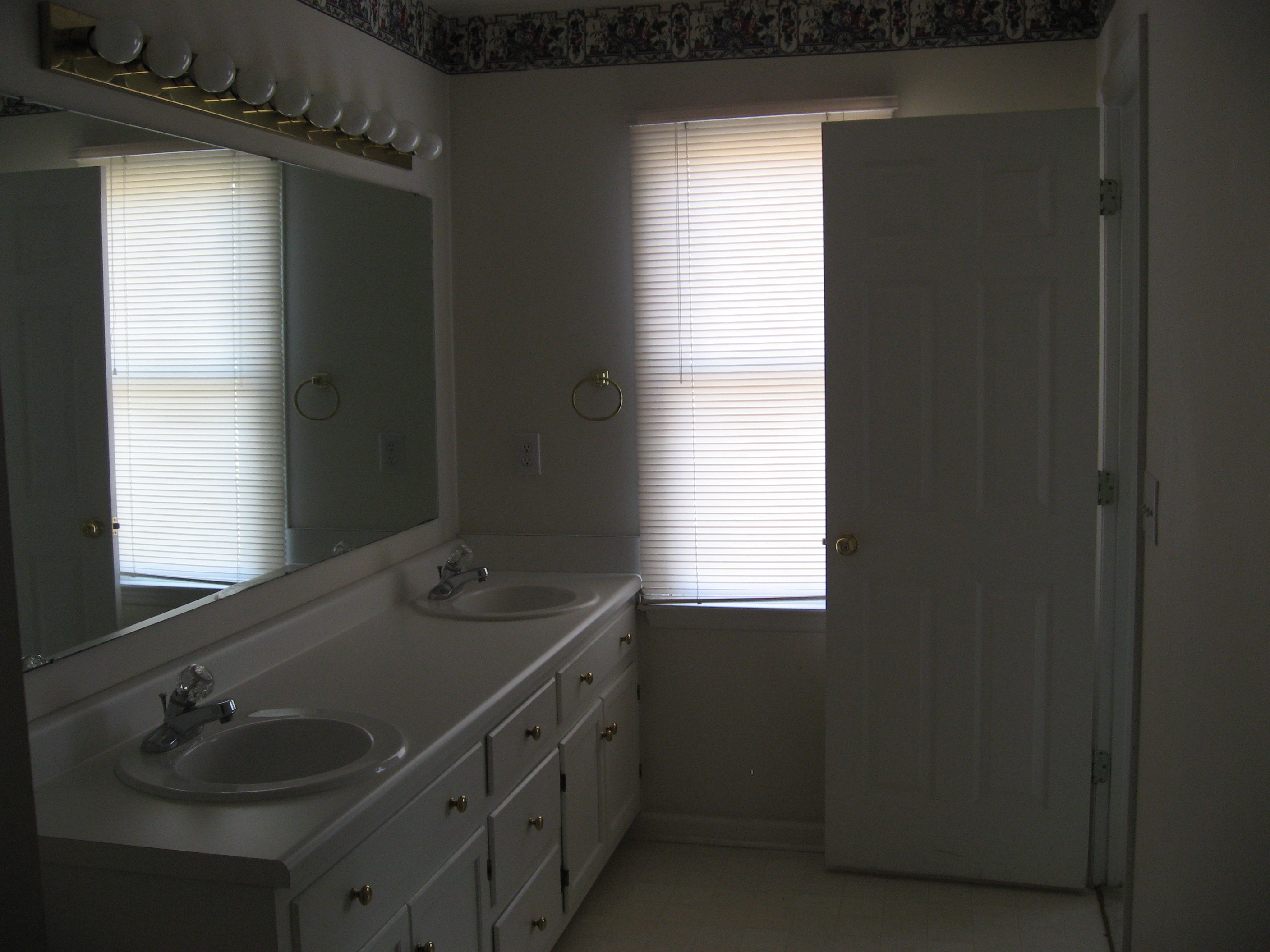
There was a little wallpaper in the form of a lovely floral border in our master bathroom:

Don’t ask me what that stuff is on the floor.
It’s looong and narrow, with the dual vanity, toilet, and shower/tub combo all along one wall. That linen closet opens to the hallway on the other side.

The previous owners sure did love their white, didn’t they?
Right across the hallway from the master bedroom is the guest bathroom and laundry room – and our second bout of hideous wallpaper. Step right up folks, and check out this maroon and paisley monstrosity! It was really difficult to get a good picture, but you get the idea:

The room with the lovely green aluminum blinds is the laundry room. It’s actually a pretty decent size for the style of house.
The old, yellow bathtub was directly across from the vanity. It was very tiny with it’s claustrophobia-inducing, grimy shower doors:

There are two more decent-sized bedrooms at the end of the hallway. We’re using one for our home office and the other as a guest bedroom.
Notice the lovely balloon fan in the guest bedroom:

Almost as bad as the fandelier, no?
And here’s the office:

Finally, we have the back yard:

It, along with pretty much everything else in the house, definitely needed some TLC.
Whew. That wasn’t terribly painful – in fact, airing our dirty laundry is just motivating me that much more to complete our projects!
I will show “after” photos of the rooms we’ve completed soon enough, but I figured it was important to give you a decent look at what we started with.
I know, I know. What were we thinking??
Click HERE for the final tour of how it looked before we moved out!

Comments
Wow, you guys sure bought into some unique fans. Too bad the level of uniqueness doesn’t equal the amount of money they’re worth, or you guys would be rich.
A note about wallpaper – when we moved into our house 6+ years ago we had horrid wallpaper in both bathrooms. The kitchen was also wallpapered, but not quite so hideously. I didn’t remove any of it, just textured over it in all three rooms. It was so easy! I’ll have to post something about it on my blog one of these days. Maybe this is the motivation I need. :-)
No kidding!! Some (ok all) of the fans here were quite horrid. And it’s unfortunate because contrary to actual room designers, we actually like having ceiling fans! Here in North Carolina they are quite practical, if not the most attractive. So we’ve slowly been replacing them, room by room. It isn’t cheap! But it will be worth it for the amount it cuts back on our cooling bills. :)
Good tip on the wallpaper! I was scared to do texture, but I was very tempted in our guest bathroom (stay tuned for pics). We ended up having to sand it off!