Kate’s Kitchen Befores and Not-Quite-Afters
Today is special. I have a busy/scary/exciting day planned here in Hawaii, so I wanted to make sure I posted something… worthwhile? … to tide you over until I get my land legs back.
I’ve been showing you bits and pieces of our finished kitchen since I started this blog.
I’ve shown you how we picked the appliances, and how we tiled our backsplash. I covered the trials and tribulations of repairing a brand new floor. I’ve showed you how we picked our granite.
But now it’s time to finally unveil our (almost) finished kitchen. (**NOTE: I still have to paint ALL the trim, and we still have some major accessorizing to do! A little decor will make a big difference.)
But first (psyche!), let’s take a look at a couple of the befores once more. (You can find a lot of the planning and layout details here.)
This was the view of the dining when you first looked into the kitchen from the living room:
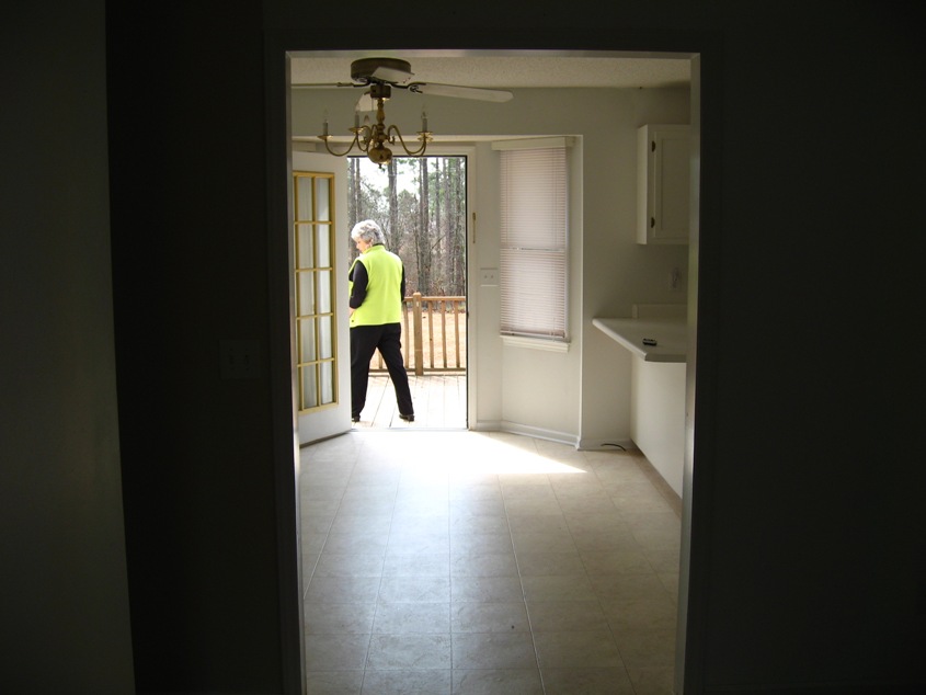
It didn’t take us long to replace that monstrous fandelier:
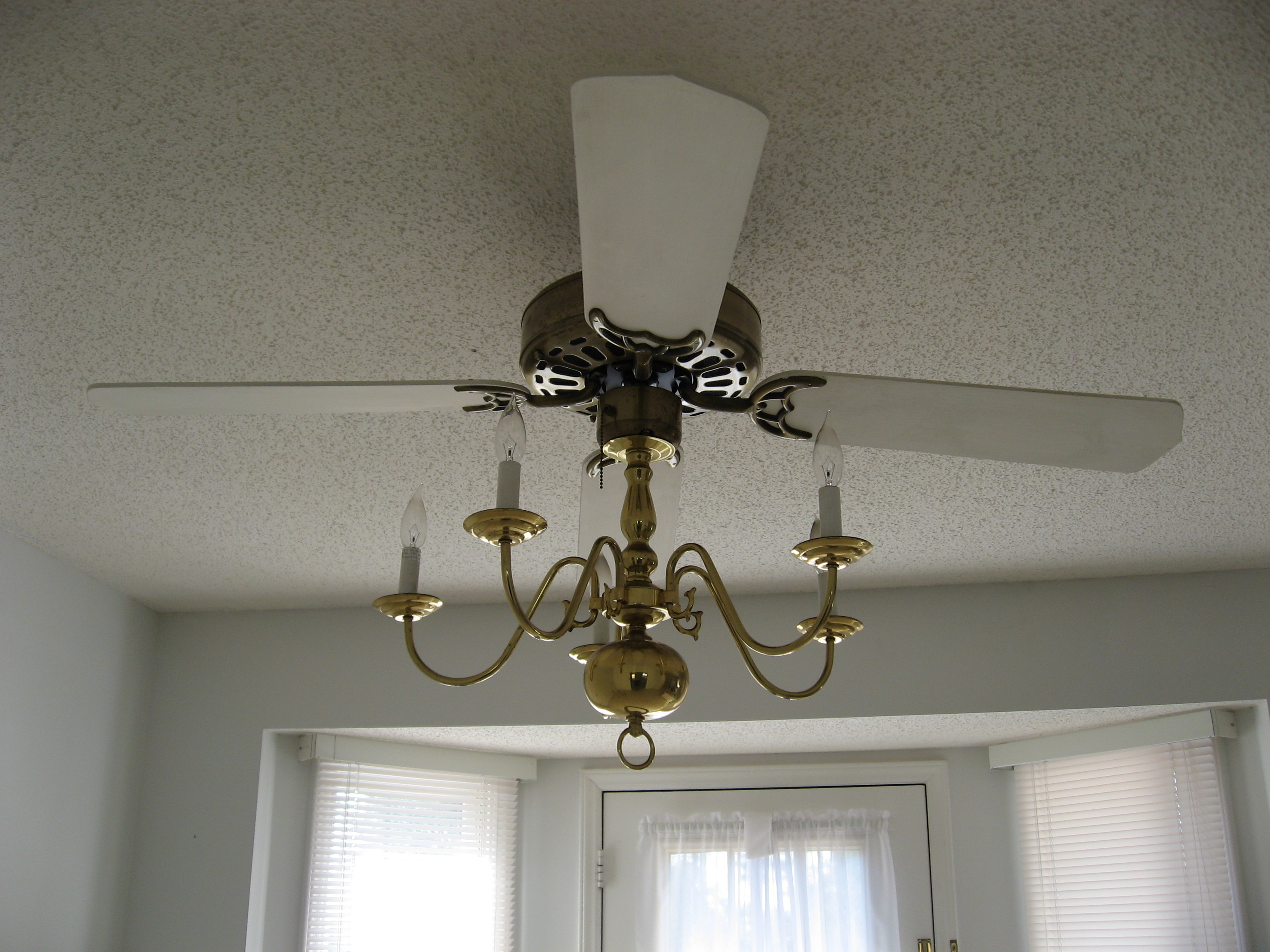
And here is how it looked when we replaced it with a generic (and resale-friendly) fixture from Lowe’s:

But everything was still white! Here’s how it looks now:

Here it is a bit closer:
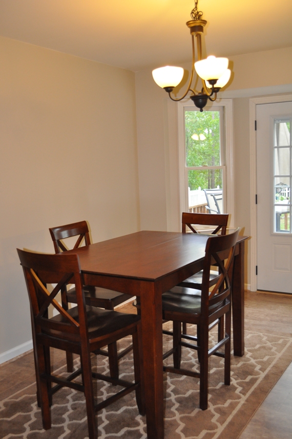
We still need to swag the light fixture to center it over the table. Unfortunately, the hubs shortened the chain back when he first installed it.
We also still need some decor, but at least the large, empty wall behind the table no longer looks like this:

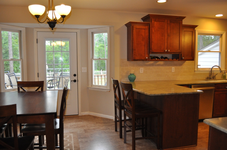
Here’s another shot from when you first walk in, just to the right of the dining area before:

And after:
A little further to the right before:
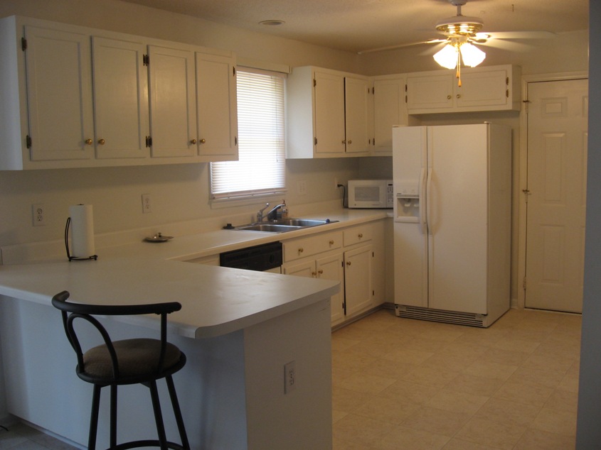
And after:

The fridge was in an awful location before:
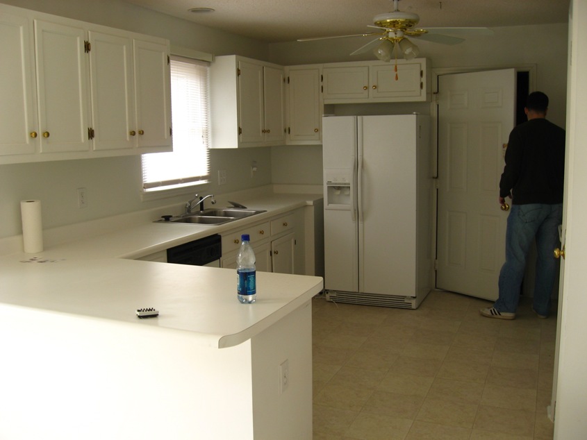
Here’s that same angle now:

The door on the end goes to the garage (please ignore the as-of-yet unpainted trim), and the cabinet on the outside of the peninsula holds the dog food, treats, and other doggie necessities:

The stove wall before:

Now there is much less wasted space:

We have a nice work surface on either side of the stove (with baking dishes and spices stored in the drawers on the left and pots, pans and cooking utensils stored in the drawers on the right):
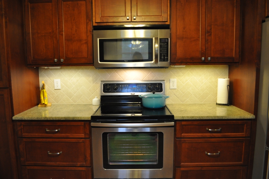
The stove cooking area is flanked by a large food pantry on the left…

…and the french-door refrigerator on the right (it’s not recessed because a counter-depth fridge was several hundred dollars more expensive, and we did not want to recess the full-size fridge into our load-bearing wall):
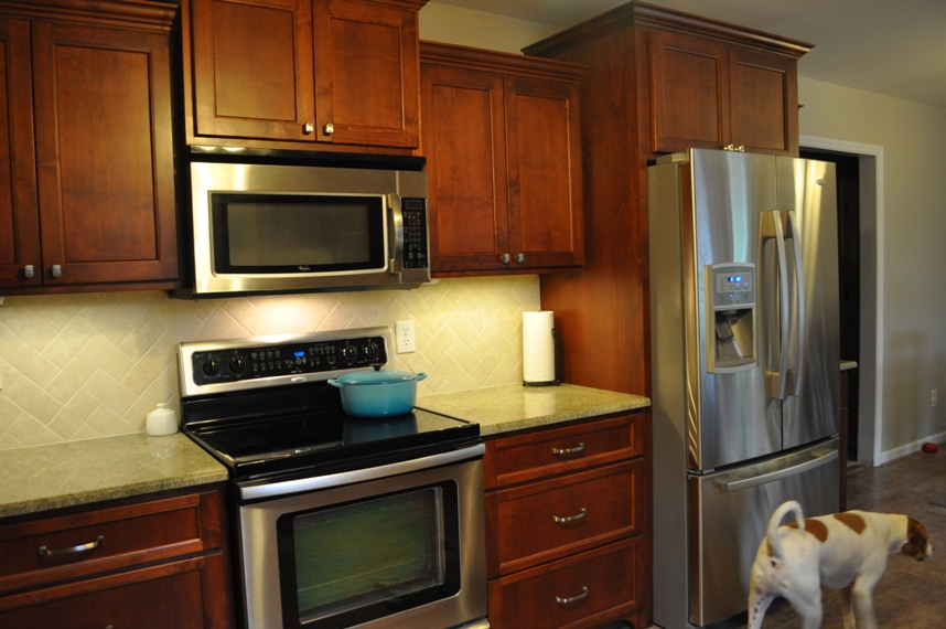
(Sorry about the dog butt.)
The extra large drawers in the peninsula hold our plates, bowls, utensils and storage containers. (Have I mentioned how much I love our drawers?)

Oops, I guess I didn’t close the dishwasher all the way.
My favorite cabinet (for obvious reasons):
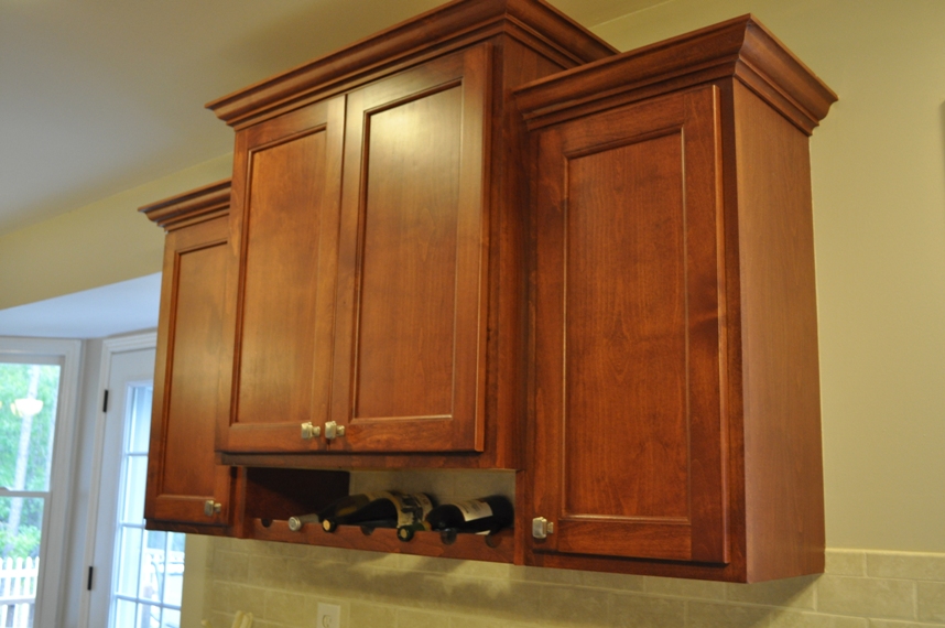
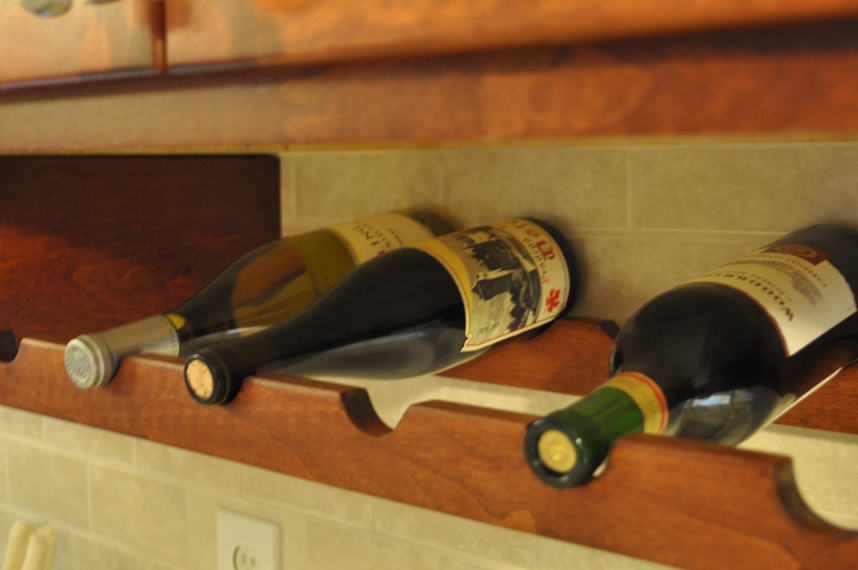
Stained alder cabinets with furniture-style toe-kicks:

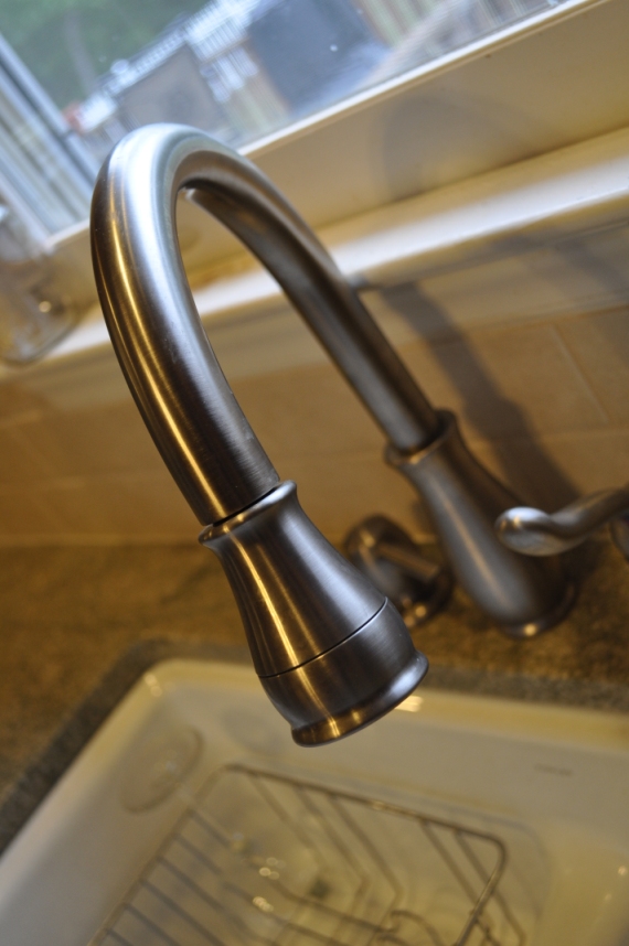
Pull-down faucet:
Cabinet hardware:

Simple ceramic backsplash:
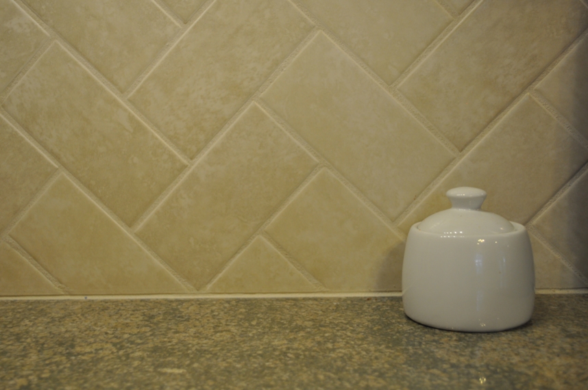
And coast green granite:

Well?
Is it okay? Awful? I know it’s an improvement from what we had, but I know my design skills (or lack, thereof) leave something to be desired. The functionality of the new space is perfect, but I don’t know… there’s a lot of dark wood here.

I’m hoping to lighten this up with some window treatments and other accessories.
Any ideas? What do you think?

Comments
I think it’s absolutely amazing and I want to come have a glass of wine with you in your new beautiful kitchen!!!! : )
You know I will have one ready whenever you have some time to visit!! I’ll even break out the “good stuff” for you. ;)
I think it looks beautiful! I wish our cabinets were dark wood like yours are! I think that the contrast dark wood and lighter walls/accessories/tile looks awesome :)
Thanks, Samantha!! It’s nice to hear that someone else likes it… we didn’t take a very practical approach when it came to designing the overall “look,” so it’s good to hear that it might still be appealing when we have to re-sell it. :)
Such an amazing transformation! It’s so nice to see you weren’t afraid of battling the white with some soft wall colours. And those cabinets? Wow! Such a nice room!
Thanks, Amy!! It’s good to hear it’s appealing – I was so afraid because so many people like white kitchens these days (new ones, not like my old one) – but the hubs really wanted natural wood.
Love the kitchen 100* better than the builder grade white! If you wanted to add a lighter color, although I don’t think it needs it, you can add a butcher block island. Last time I watched HGTV kitcen islands of a different color/material than the kitchen cabinets and countertops was the trend.
great transformation…color me green.
Thanks for the suggestion! I’d love to have an island, but unfortunately there’s just not enough room. I think it would get in the way when I go from sink, to stove, to fridge, etc. It would also block the path to the garage door. But I DO love those butcher block counter tops. I probably should’ve gotten a different color kitchen table, but oh well.
Hello! I just found your blog and am very amused! I wanted to say that your kitchen is beautiful! You did a GREAT job! I cannot believe the amount of counter space you have now and how great the stove wall looks compared to the before picture. It appears you really thought about everything (up to the tiny details) which make the most impact. You get a ton of light in there it seems, so the dark wood looks right at home!
I’m looking forward to looking around some more!
Thanks, Sarah! I’m really loving our new space (even if it is a tad dark), so I really appreciate your feedback. I know certain elements are “questionable” from a design-standard, but I’ve pretty much considered everything during this process. If you ever need help with a kitchen reno of your own, let me know – I’ve been through the gamut. :)
LOVE your kitchen! I don’t think there’s too much dark wood at all. It’s amazing. That’s the kind of kitchen I’d love to have!
Thank you!! That means so much to me! I love cooking in it, that’s for sure.
Hi, I just found your blog today and I’ve had fun reading your posts! I LOVE your new kitchen! I’m going to go read about your decision/planning process ASAP. I’m hoping to do a kitchen reno on the cheap in about a year and it’s been a lot of work dreaming of the possibilities already! I love white kitchens, but I’m afraid they’re trendy and everyone will be wanting natural-colored wood again in a few years. Glad to see you went with what YOU (and your husband) really like, cuz you’re the ones who get the pleasure of seeing it every day!
Ellie, thanks so much for reading, and thanks for the compliment on the kitchen! When you’re not working with a contractor or designer, it’s easy to second-guess your design choices along the way. It’s good to know that it didn’t end up hideous. :) I did a lot of planning, much of which I didn’t even get a chance to cover here. Let me know if you have any questions as you get closer to your reno (it’s good to start considering your design early – that way you’re not rushed when you’re actually ready to get started). The people in the Gardenweb kitchen forum (I linked to them a couple times) were also extremely helpful with considering all of the options for my layout. Good luck!!
Wow! Congrats on your new kitchen. That fan/chandelier combo was the WORST fixture I’ve ever seen!
Yeah… the fandelier was pretty bad. I wish we had kept it to hang in the garage or something – just for fun. :)
Gorgeous kitchen. I love wood cabinets, and your simple backsplash is going right into my inspiration folder. I can see all the planning that went into the increased functionality, especially on the stove wall… and it’s beautiful, too!
I really laughed out loud when I go to the picture of “my favorite cabinet (for obvious reasons)” — I’m in mid-remodel and am slowly discovering the wisdom of “don’t pack up all the wine glasses!”
I’ll think a bit about colors/subtle ways to bring more light into the room, since that’s something you want to work on a bit. Hopefully I’ll post some ideas for you on your thread over in the Kitchen Forum.
Kudos! Job well done…. and thank you so much for sharing the before/after photos.
I love your kitchen! It’s so pretty and real! Many kitchens I see I just can’t relate to because they’re just beyond anything I’ve ever had or ever expect to have–and I’m in my fifties. Yours I can definitely picture myself in. :) Your cabs are beautiful–just about the color I think I’m going to use in my kitchen re-do because it will go with our trim and doors. I love your backsplash–the pattern is great–definitely keeping it in mind. Be glad–be very glad–you didn’t put an island in. Your kitchen is definitely too small for one unless it’s a portable one that you could keep stashed somewhere else. I have one and it just congests traffic–I hate it! Unless we decide to take the wall out between our dining room and kitchen, the island is going and we’ll put in a small peninsula instead. Enjoy creating wonderful meals in your new kitchen!
Sandy, thanks so much!! I can’t believe my kitchen is going in someone’s inspiration folder. Never thought I’d see the day. :)
Brenda, thank you! I guess mine seems “real” because it’s definitely not one of those $50K + kitchens we see so often. There’s just no way we could spend that kind of cash, so some definite corners had to be cut. And I’m very glad we didn’t get an island – that would’ve driven me nuts. I kind of think they’re overrated, anyway. :)
Katie, I love it.
I would have had something totally different but I do love what you have done. I think design wise, everything works except maybe a different colour for the countertops and the table? Hard to tell from a photo as well as the coast green colour you mentioned doesn’t show up so well.
But I am amazed that you did all this. I’m going to fly you out to do my decor if and when I get a house.
Thanks! Honestly, I would’ve done something completely different too if the style of the renovation didn’t need to be determined by budget and resale value. Unfortunately here in the suburban U.S., we’re pretty limited as far as what’s going to appeal to buyers. :)
And you can fly me out anytime, LOL! I’d love to see Australia before I die.
Hi Katie- I just found your blog today and I *love* it as I am also domestiphobic. Like, REALLY domestiphobic. I was relieved to read your posts and find out I’m not alone! Anyway, just wanted to drop a line to say that for not using a designer I think your kitchen is stunning! Particularly the built-in wine storage; I love that. Not that you need it, but if you ever want some free (actually free, not fake-free-until-the-hidden-costs-crop-up free) design advice in the future, it’s kind of my job :) (I’m still trying to build up a network & portfolio, hence the “free”)…but congrats on the gorgeous reno!
Thank you! I’m still not thrilled with how it all came together (how the counters look with the floors, for example), but yeah… I feel like for not using a designer, it definitely could’ve been worse. ;)
I checked out your site – do you only do advice on tiling, or room design in general? I’m currently working on my office, and though I don’t plan on doing any tiling in here, I could always use some design wisdom!
Absolutely it could have been worse- You should see some of the pictures my clients have come in with after trying to design their own kitchens and failing epically! We’ve actually had clients have to rip out their brand new tile backsplashes because they didn’t realize that it was so busy with their granite until after the install…always an unfortunate situation. You were very wise to use the tile you used :)
And I can definitely offer some design wisdom! :) I’m working on becoming a freelance interior designer, it’s just a bit difficult at the moment due to some work permit issues. I’m just specializing in tile at the moment because it’s where I currently work (plus I figured if I focused on a niche, I have something to differentiate myself…competition in design is fierce where I live!). But yeah I would love to help you out! My email is tiletramp@gmail.com :)
I have a super busy week this week, but expect an email possibly sometime next week! Thank you!!
Sounds great! I will be ready with ideas whenever you would like them :)
PS: Just linked to this post as a “real-life” example of how to use subway tile in a herringbone pattern, just thought I’d let you know :)
http://tiletramp.wordpress.com/2011/05/06/10-creative-ways-to-use-subway-tile/
I had an electrician move my chandelier. Of course it left a second hole in a “star” textured 1980’s ceiling. Answer = Ceiling Medallion! I painted it to match the chandelier and it covered the hole! Crisis averted. Love your kitchen blog/info!
Thanks for the tip, Marjie!
[…] right — we’ve completely remodeled the kitchen, gotten well on our way to finishing the living room, polished off the hallway bathroom, have a […]
[…] it’s come to some of our earlier remodel projects like the kitchen or the guest bath, we didn’t work with a super strict budget because we knew we’d still […]