Alaina’s Kitchen Before-and-Afters
Well, it’s finally here. The post we’ve all been waiting for.
No, I’m not showing you a picture of my awesome abs.
It’s not because I’m shy. And it’s definitely not because they’re not there. Oh, they’re there. It’s just that they’re hiding behind a small layer of leftover holiday pudge. I’m sure they’ll come out when they’re ready.
This is a process, people. It can’t be rushed.
So. Do you remember my friend Alaina and how I started telling you about her kitchen remodel back in April of 2010?
Well. I finally – finally have photos of the end result.
And let me just tell you – it was well worth the wait.
“A” and her husband Dirk gutted their dated, boxy kitchen (cabinets, floors – even some walls!) and completely transformed the main level of their house.
In case you missed them, here are the series of posts that take us through some of the more painful aspects of a full kitchen remodel:
Other Peoples’ Messes: How we Thoroughly Demolished Alaina’s Kitchen
Other Peoples’ Messes: Alaina’s Kitchen Progress
Other Peoples’ Messes: Alaina’s Kitchen – Wall Removal Before & Afters
Other Peoples’ Messes: Alaina’s Unique Flooring Solution
Other Peoples’ Messes: How Alaina Shopped for Granite Counter Tops
And if you want to see other kitchen related posts, you can read through the mess we created in our own much smaller and budget constrained kitchen renovation, including layout planning advice, how to choose the right appliances, and even a step-by-step guide to tiling your own backsplash, right here.
But now on to the good stuff.
Don’t mind the phrase, but I’m just going to start with the “money shot” because that’s what you all came to see. Then we’ll follow up with some details. Okay? Okay.
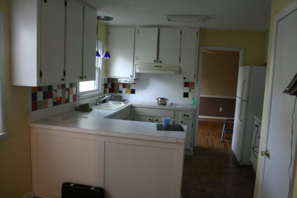
Before:

After:

Ummm…. WOW. Even with the darker cabinetry and counter tops, the entire room is much brighter thanks to some strategic wall removal and an additional window behind the sink.

Back in the pre-kitchen remodel “dark days,” this lovely wall used to greet you when you looked into A’s living room from her front door:

Unfortunately, this is a load-bearing wall. So it couldn’t come down completely. But, with the help of a contractor, they were able to remove a portion of the wall to create a breakfast bar and pass-through, and, most important, stunning views of the lake right when you walk in through the front door.
Here it is mid-reno:

That small change really opened up the main floor. Alaina and Justin are standing in what used to be their tiny, closed-in kitchen.
Here’s how it looks today:

*The brackets under the bar will soon be fixed by the granite installers and that wall will get re-painted.
They also removed the wall that divided the breakfast area from the main part of the kitchen, creating an eat-in kitchen (they already have a separate dining room).
Here it was before:

And here it is right after they removed the wall surrounding that open doorway:

And here it is today!


Beautiful, no? And that’s not all. We still have a special treat. You might be noticing that there doesn’t seem to be a lot of space in the way of wall cabinet storage and food storage (that “room” to the right of the refrigerator is actually a utility room – not a pantry).
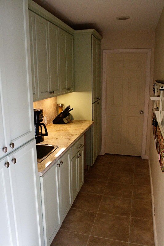
But no worries – See that doorway to the right of the microwave cabinet? What used to be a narrow hallway that held their washer and dryer and leads to their office has now been transformed into a stunning “butler’s pantry”:

On the wall to the right, Alaina created a “message center” with a calendar, dry-erase board, and place to display photographs:

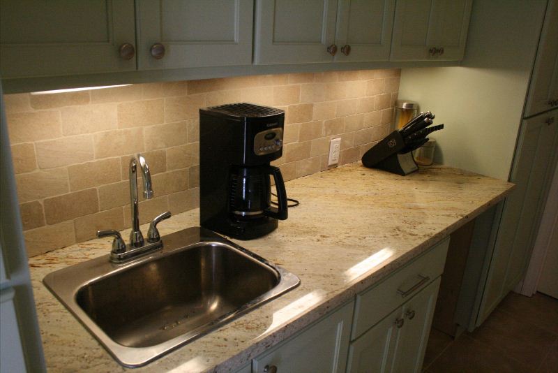
On the other side are two large pantries for food and small appliance storage, as well as a sink and a space for a future wine cooler:

I have to say, I’m pretty much in love with this new space.
From the stunning granite, to the custom cabinets – it looks as though this kitchen has always been there. And that old monstrosity with the cheap white cabinets, worn linoleum flooring, and psychedelic backsplash tiles is but a bad dream.
Here are a few of the deets:
- Cabinets:Travis Alfrey
- Cabinet Hardware: Lowes
- Granite Name: Atlantis
- Granite Fabricator: World Granite and Stone Art
- Granite Supplier: Cosmos
- Fridge and Dishwasher: LG
- Oven and Microwave: GE
- Porcelain backsplash tiles: Best Tile
- Pendant Light: Light Bulb City
- Faucet: Lowes (They bought theirs on sale)
- Range Hood: Overstock.com
- Flooring: DuraCeramic, by Congoleum in “Sunny Clay”
So what do you think??

Comments
Stunning makeover! I love the new light fixture, and the way they stairstepped the backsplash! Gorgeous! Opening up the wall for a passthrough to let the light and view through was genius. They must be so thrilled. Thanks for sharing.
Thanks for the comment! They are definitely loving their new space. I’ve been to a couple of gatherings, and the difference is just remarkable. People can chat and cook, and there’s plenty of space for everyone. My husband helped them install the backsplash to save a little dough, and I have to agree – I love how they left it “rough” on the edge.
Wow, that is certainly one helluvah change! The remodel looks amazing. I love the way you started writing this post. It’s hilarious and very entertaining. Keep writing for sure.
Thanks, Nate! Maybe I’ll keep writing and doing crunches. ;)
Very nice granite. Love the depth and movement, and it still manages to be understated.
Kelly
I love her granite, too! She didn’t send a picture that shows it, but they cut one of the slabs in such a way that you can see a large vein run across one portion of the counter, and then it continues on the other side of the “L” shape. Very beautiful!
That crazy backsplash took abs of steel to pull off! Okay, not sure what I am talking about but love it! Congrats and enjoy.
Haha, yeah I’m not sure what the connection is either, but I ran with it. :)
It is wonderful! I can’t believe how her old kitchen looked so much like yours!
I know! Hers had a bit more color (which, in this case, wasn’t necessarily a good thing, but those cheap white cabinets were just as bad as ours. But with probably about 30 years worth of grime built up in them.
Wonderful remodel! I’m loving the stair stepped backsplash and all the great daylight they have. I’m certain they enjoy being in their new space.
your chatty writing style is so much fun to read I had to sign up to follow you~
Thank you!! And yes, they definitely enjoy being in their new space. And I enjoy them feeding me in it. :)
LOVE that light fixture. So pretty :)
Me too! It definitely ups the elegance factor in the room.
Wow. Really amazing. I’m totally jealous. I want a kitchen and space like that. Looks like they have an amazing outside view as well? Are they on a lake?
Yes! They’re on a small, pretty lake/pond. That cutout in the wall where the put the breakfast bar allows you to see the lake right when you enter the house now.
I am loving Alaina’s kitchen! :-D So jealous.