Indecisiveness — not Curiosity — Killed the Katie
Hey, so remember the time I thought about decorating the office since I actually use it now and then a style quiz called me an alcoholic?
Well it turns out that quiz might have been on to something, because while I’m not an alcoholic per se, I would prefer to sit down and kick back a glass of vino while discussing the latest book I read over perusing the interwebs for office inspiration photos and staring at paint swatches. Which is why it’s been… erm… 4 months since I declared I’d be decorating the office and have done exactly 1 thing: bought a desk.
It’s not that I’m lazy. It’s just that I’m so indecisive, I could probably spend so much time looking at a dinner menu that the table next to me would have sat down, ordered, eaten, enjoyed some after-dinner drinks, smoked a couple of cigars, went home, had sex, and gone to sleep.
I never know what I want! As the style quiz correctly determined, I’m into “Cozy… not oversized… a handcrafted gem.”
Yep. That’s me.
I’ll admit it — I’m not hugely into the all-white/beige/cream trend that seems to have taken over the design blogosphere. I mean, sure it looks gorgeous, but is it really all that practical?
For my lifestyle, NO.
I like warm colors. I like comfortable. I like reading a book in an over-stuffed arm chair with a crocheted blanket thrown over my legs. I don’t love cleaning, I don’t own stacks of design magazines, and I definitely don’t collect little white ceramic animals and vases.
So why the heck did I buy this ultra modern, clean-lined, super white desk?
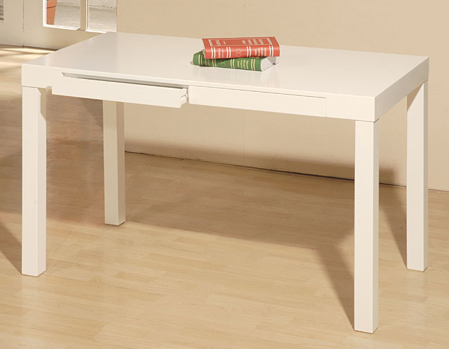
And more important, why am I painting another one to match it?
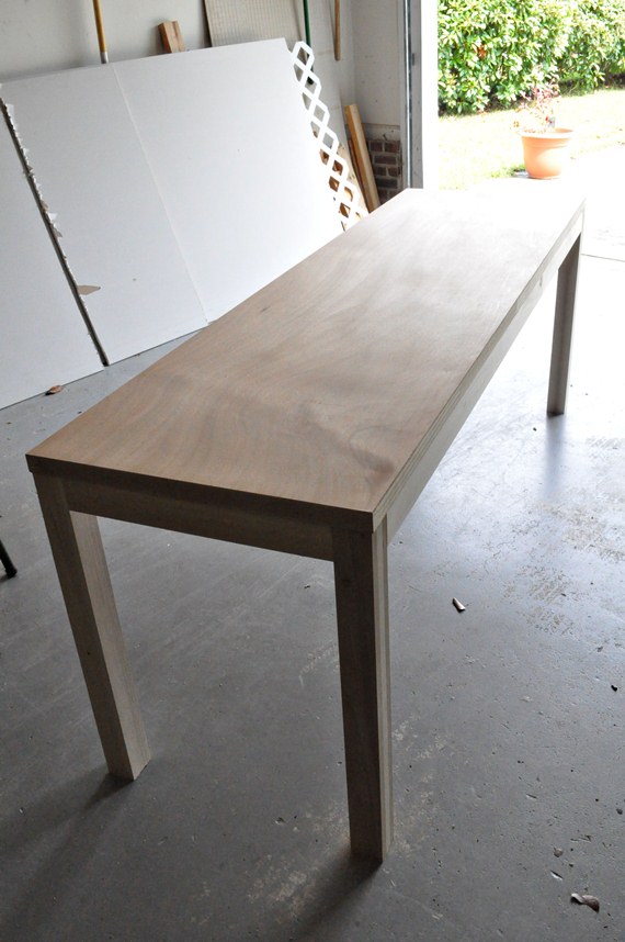
I guess it comes down to functionality. I have a very cluttered mind, which, it stands to reason, would result in a very cluttered home office. Therefore I think, when I ordered this desk, that I had a vision of a clean, minimal design, highlighting function, organization, and productivity above all else.
A room that screams, Just shut up and write.
Except maybe a little more tactful.
Something like this:
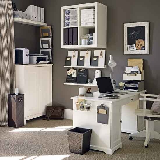
Photo source.
Or this:
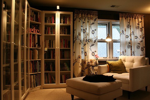
Photo source.
Or this:
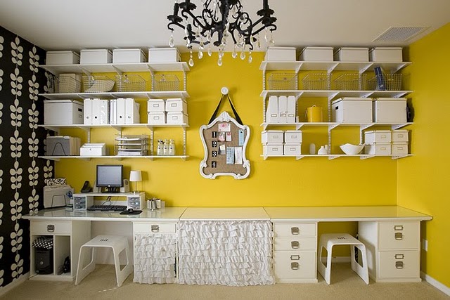
Photo source.
The problem? These all require dark, bold wall colors, and I am not repainting this sucka.
I realize I didn’t clean up any of my junk, including the fugly dog kennel, but here’s how the office looks now:
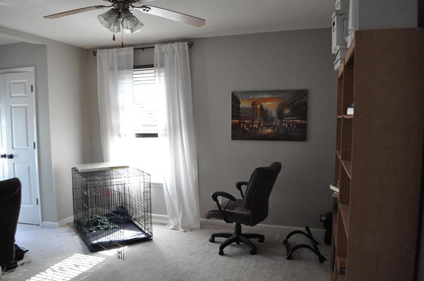
View right when you walk through the door. See that pull-up bar in the lower right corner? Yeah… I can almost do half a pull-up now. Probably because the pull-up bar lives on the floor. Should I keep this painting? I’m thinking I could pull some colors from it to use in the rest of the room.
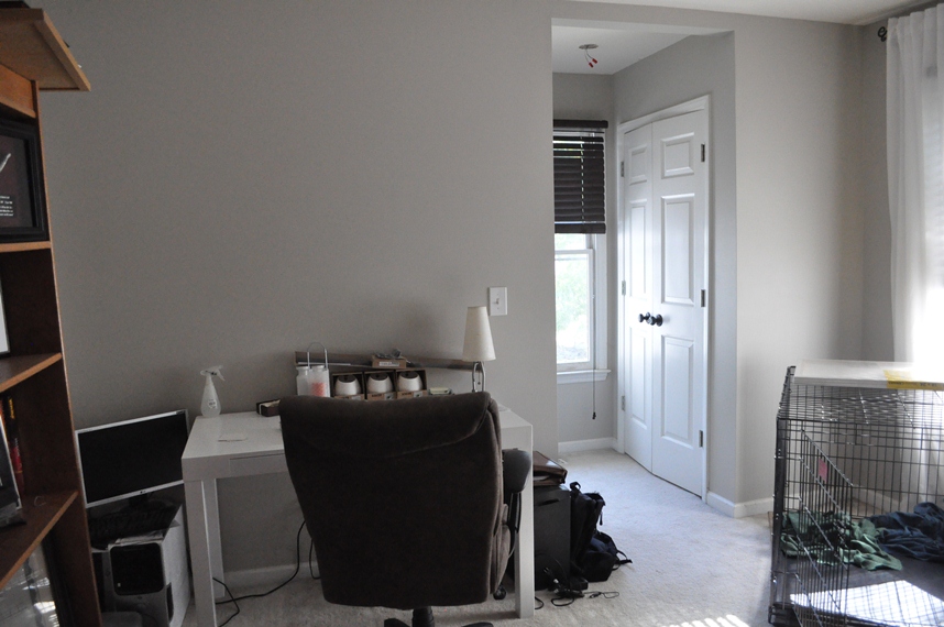
Turning left… Yep, that’s my new desk, buried under junk from my trip to IKEA and an old office chair I wasn’t able to sell. See that closet on the right? There’s another one directly across from it. I guess the architects designed it like that so there could be a window between to let more light in the room. Those old computer towers in the lower left corner will be going away. Eventually.
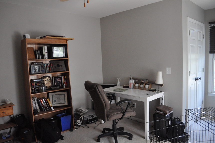
Turning left some more… Wow, that’s embarrassing. Here you will see no less than 3 camera bags sitting on the floor, my blue college trash bin, and a $10 bookshelf filled with… can you tell?… Justin’s Star Wars book collection. I plan for the long desk he built to go on this wall in order to form an “L” shape with the existing desk.
Then, I think I’ll put some open shelving above the long desk with my IKEA file storage boxes, and maybe a bulletin board and/or some other organizational items on the wall in front of the short desk.
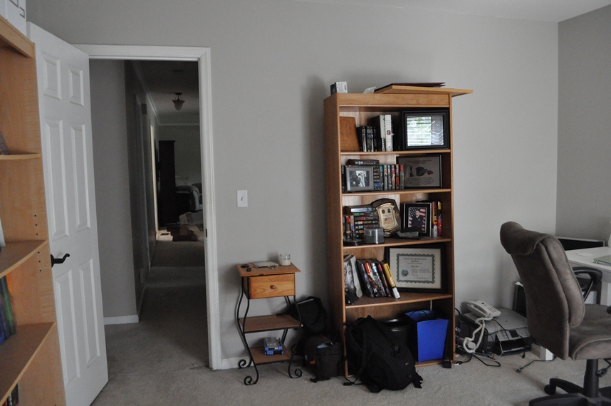
And one more turn… For some reason I neglected to take a photo of the wall to the left (or immediately to the right when you walk into the room. It currently contains 2 more cheap-o bookshelves with my books.
So there you have it. Here are the issues I’m willing to address:
- Wall Shelves. I’ve already bought the wood for 2 long shelves to go on the wall with the entrance to the room (above photo) above the long desk. Should I stain them or paint them? What color? Remember, below them will be a white desk, and on them will likely be white boxes and magazine folders from IKEA. So white shelves are not an option. I’m all whited out.
- Book shelves. It would be a huge pain, but I’m willing to paint these. Should we keep all 3? I like the idea of setting up a “library” corner in the corner of the room you view right when you walk in (right side, first picture). Should I paint them? Should I keep them together? Should they all go on one wall? In the corner? What?!
- Lighting/Accessories. I might be able to swing something by way of inexpensive desk lamp or ceiling light, but the budget is pretty tight on this project. Like… nonexistent. Like… I’m kind of at the end of my jobless grace period. So I pretty much have to work with some paint and what we have.
- Painting. Should I keep that painting? If so, where should it hang? Should I use it for other colors in the room by way of accessories? Looking through my Pinterest inspiration photos, I’m noticing a trend with a burnt orange color and/or a bold green. Orange is in that painting; green is not. (*I take it back — green IS in the picture! It’s in the leaves of the tree right in the middle.) Here are some of my Pinterest photos:
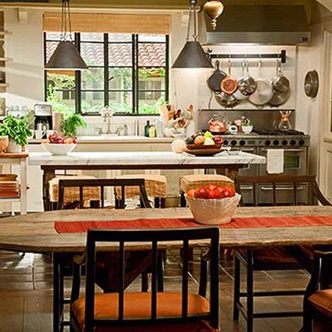
Photo source.
I love this kitchen from the movie, It’s Complicated. Maybe I could paint the book shelves a rusty green and have the burnt orange as an accent color somewhere??
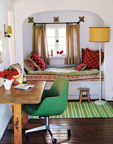
Photo source.
Another photo with natural, rustic-looking wood has me thinking I should paint the book shelves a crisp white and distress and stain the wall shelves above the desk to look like the desk in the photo above.
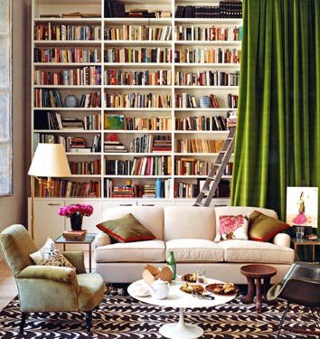
Photo source.
White shelves with colorful books. I could do that…
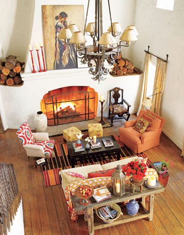
Photo source.
More wood, orange, and white. I’m starting to see a pattern…
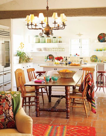
Photo source.
Hey, I’m more consistent than I thought!
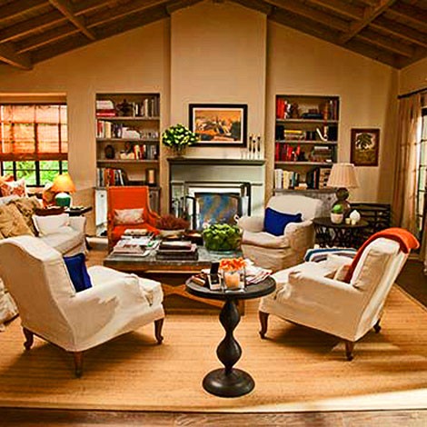
Photo source.
Orange… green… wood…
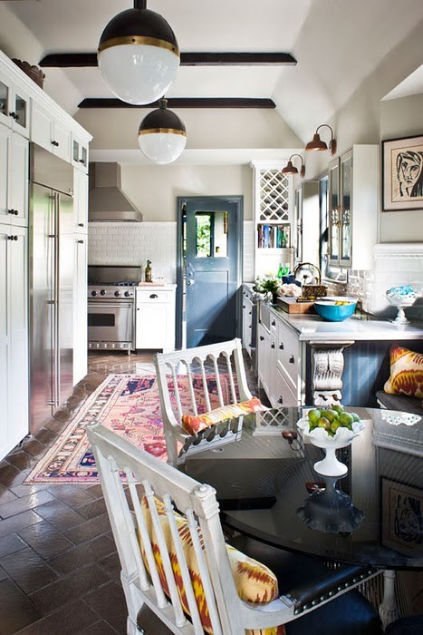
Photo source.
This one’s slightly different, but I love that muted blue color, which also happens to be in the painting.
Let me ask you. Did I already screw this up by painting the walls gray? By buying/making white desks? By being an idiot when it comes to design??
Tranquilla.
In retrospect, I probably should have tried to find a great piece from a thrift store and refinished it to get the used-but-loved look I’m pretty sure I like but have never been able to achieve (aside from the puppy teeth marks on my ottoman legs). And I definitely should’ve come up with a design plan before getting started. You think I would’ve learned with the kitchen!
Bottom line?
I need help. And I’m counting on readers like TileTramp and YOU to help me.
So? What should I do? Besides say “screw it” and pour myself a glass of wine at 10 a.m. because it’s just an office? (And that quiz thought I was an alcoholic. Puh-leeze.)

Comments
You’ve got some wonderful ideas. I would paint the shelves that blue color that is in the painting if you are keeping the walls white. I’d paint the bookshelves white, to keep all the furniture the same color. I’d keep the lighting rather contemporary and leave it white, too, or blue. Just my opinion.
Oooh! I really love your idea to paint the wall shelves blue and the book shelves white. If I’m feeling extra snazzy, maybe I could paint just the back of the book shelves blue as well.
Just one clarification — the walls are really a gray color (see how they look next to the white desk and trim?). Do you think the blue would still look good with that?
Well. I would leave the walls gray, but maybe do one wall in a bold color- orange around the window perhaps? For the bookshelves- for sure paint them white, put them on the same wall & find a fabric that has a bold pattern on it (in orange) to line the back. To tie the shelves together & make them look more spendy- add crown moulding to the top. For the open shelves, I like the idea of the rustic wood look. I am really good about planning out rooms, but never seem to get them done. I have grand plans for the nursery & as of right now its empty with the exception of the crib. I’m working on it though! Maybe I too need some wine. :) good luck!
You know, I just don’t think I’m brave or committed enough to paint an entire wall orange. I think in the end I’d probably love it, but I’d worry about potential buyers (when we sell in the next couple years) not digging it.
Fabric is an awesome idea for the book shelves! That way I wouldn’t have to deal with trying to paint that cheap cardboard stuff… and I love your idea for crown. I wonder if I could pull that off and have it look decent.
Now I’m torn between rustic wood and blue for the shelves. I suppose I could use that dark, muted blue for some of the accessories…? Photo frames, bulletin board frame, etc.? maybe that tiny little telephone table you see in that last pic of my office? Same could be said for the orange.
That little wall around the window wouldn’t be too tough to paint, would it? just in that nook? Then when it came to resale, you could cover it quickly. Blue accessories would pop with the orange. The fabric is super easy to do on the back of those shelves. You just pop off the back cardboard piece & use spray adhesive (I’ve even just used duct tape) to adhere the fabric, and then just staple it back on. The toughest part is getting the design of the fabric straight & even that isn’t too tough!
I do like the idea of the blue and orange… so long as I don’t get too bold or make it look like whatever sports team that is. :) Hmm… maybe I could do more of a solid fabric since the books will be busy anyway… but then I could still get a pop of color. I like the idea of the spray adhesive! I’ve never used that before. Thanks!!
Heeeeeeeeere I come to save the day!
First of all, I love your wall color. You didn’t screw up anything by painting it that color; it’s still neutral enough to go with anything & everything.
Second of all, your layout for the desks is perfect. The long shelf idea is also great, but I wouldn’t paint them a color, I would stain them (if they’re wood) a warm wood color. That’ll keep the room from becoming too stark.
Thirdly, I know it’s going to be a major pain, but the bookshelves will look soo much better in white. That way your books and whatever else you put on the shelf stands out; not the shelves themselves. It’s the easiest, fastest, and cheapest way to turn cheap-looking shelves into nice ones. Like the previous commenter said, if you can find fabric or wallpaper in a pattern you like (with a bit of orange in it) to line the back, they’ll look fantastic! Even just white with your books on them will look great though.
Fourthly, keep the painting for sure! It’s beautiful, and I like the idea of pulling orange tones from it throughout your office. If possible, over time, try to get some cheap IKEA frames (like the birch ones for like $5 or whatever) and just frame some photos you like, and paint some of the frames orange, white, and a third color of your choosing from the painting (I like yellow). It’ll tie in the painting and won’t cost you a whole lot. Also, the bulletin board is a fantastic idea because if you find yourself wanting to tie in some more orange, just find some orange crap and tack it up there! And, if you change your mind, you can focus on a different color by just taking up other random stuff. But honestly, it’s much more difficult to design with two vibrant colors in mind, so I would pick one (like orange), and work with that to start.
Fifthly, if you could swing it, a table lamp with a patterned shade like this: http://www.ikea.com/us/en/catalog/products/80179249, ties in multiple colors from the painting. The extra lighting would help bring some warmth to the room too.
Sixthly, put all the bookshelves together on one wall, it’ll make for a more dramatic statement, especially if they’re all painted white. I also recommend (depending on the size of your collection), grouping your books by color. I’ll send you a pic of mine at home when I get a chance; it looks awesome and again, doesn’t cost a thang!
Seventhly (is that a word?), again, over time and if you ever have some free money laying around, invest in a comfy fur blanket (not real, Target has fake ones from time to time) in a graphic print like zebra or something for the chair. Not only will it kind of mask the color of the chair a little, they’re a delight to curl up in while you’re working and everytime you look at it, you’ll get a cozy feeling :)
Eightly (eighthly?), I apologize for this ginormous comment and you can take all of these ideas with a grain of salt!
No, this is awesome! I love that this comment is so long. That’s a lot of fantastic ideas all in one place! I love the idea of using a blanket to cover my fugly chair. Good office chairs are so expensive, and we’re just not in a place to purchase one right now. That lamp is adorable!!! I don’t have an IKEA near here though (my friend and I had to make a 3 hr trip — each way — to get to one last time), but maybe I could find a DIY tutorial to change the shade on an existing lamp.
Painting the book shelves white is pretty unanimous, so looks like I’m stuck with that fun job. :) Both you and Jeannine said to put them along one wall, but I’m not sure where I should do it. If I put them on the wall to the right when you walk in, you only see the side of the shelves and a big, empty wall straight ahead (with maybe just that painting hanging on it like it is now). If I put them on the wall straight ahead, it might look a little cluttered next to the window… I used to have all 3 in the corner — one at an angle and one on each side. I could do that again, but of course that might make adding crown a bit tricky…
1. we are seriously the same person. i’m so indecisive about everything!
2. i’m currently moving my shit to my fiance’s place and combining it/redoing all his shit and i can’t decide on a single thing. and lighting is a bitch!!! we went to ikea last weekend and i wanted every single shelving/desk unit they had, but can’t afford anything either ;/ trying to work out some options for a very small office space at the moment as well!
3. no joke, i get so distracted with looking up inspiration ideas for rooms that i got half way through your post and after all the assorted rabbit trails it’s five hours later.
4. i hold you personally responsible.
You have no idea how much I can relate to #3. Whenever I finally get it in me to look for inspiration, I end up 5 hours down the line with 3 open browers and about 20 tabs each. If you haven’t signed up for Pinterest yet, you probably should — it’s a life saver when it comes to organizing all those pictures AND remembering where they came from. If you need an “invite,” just let me know!
If you have a plain white lampshade, you can probably achieve the same effect with some paint and creativity :) Or else buy some wide ribbons and glue them to a white shade (vertically, horizontally would be a b*tch) in whatever colors you like.
As for the bookshelves, I actually think putting them next to the windows would look great but *ONLY* if you put the painting on the empty wall and did some sort of montage with frames, mirror, etc. etc. to fill the space. Otherwise, put them on the wall and hang some picture frames on the side of the bookshelf, or if you have a potted plant somewhere you can move, put it there :)
Okay, so I still have to do some measuring, but it’s looking like only 2 bookshelves will fit on the window wall. Considering only 2 of my bookshelves match anyway and the other is an oddball, should I scrap 1 and just use the 2? Or should I put all 3 on the wall to the right? And are you sure they shouldn’t go in the corner? :)
They could definitely go in the corner! To be honest, it’s difficult to get a completely accurate sense of the room and the corner you’re talking about, but I like the idea…also, I’d keep all 3. Fun design trivia: everything looks better in 3’s (or odd numbers). No idea why, it just is what it is!
I’ll have to sketch up a floor plan with measurements and send it to you — my lazy self hasn’t gotten around to it yet. :)
[…] when I declared I was going to clean out the garage or organize my office or build storage for the master closet or decorate our […]
[…] old-world, craftsmany style I consistently seem to be drawn to (scroll down to the bottom of this post for examples, and go check out this post to find out your style — apparently I’m a […]
[…] mostly, it’s my indecision that’s the cause of the hold-up once […]
[…] even though I didn’t get up early enough to polyurethane that desk on Saturday morning because I was sporting a massive red wine hangover headache induced by the […]